Iguana: Energy Drink Packaging Design
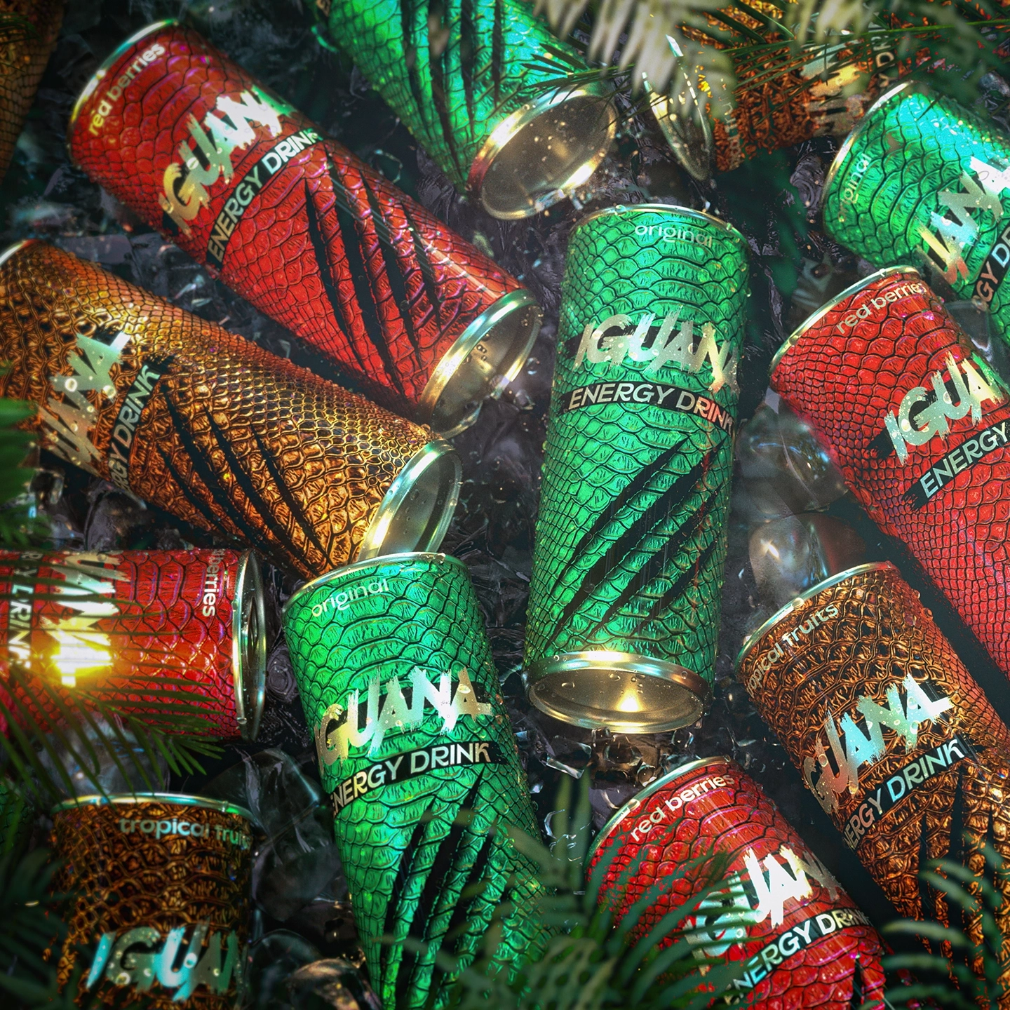
The client approached us with a name already in place—Iguana. Our task was to develop a packaging design for the energy drink that would make it stand out on the shelf, outshining competitors, while maintaining a strong connection to the brand’s identity. The challenge was not only to create a visually striking and bold style but also to incorporate elements that tied the product back to its name.

We didn’t expect such a bold solution, but we instantly fell in love with it.

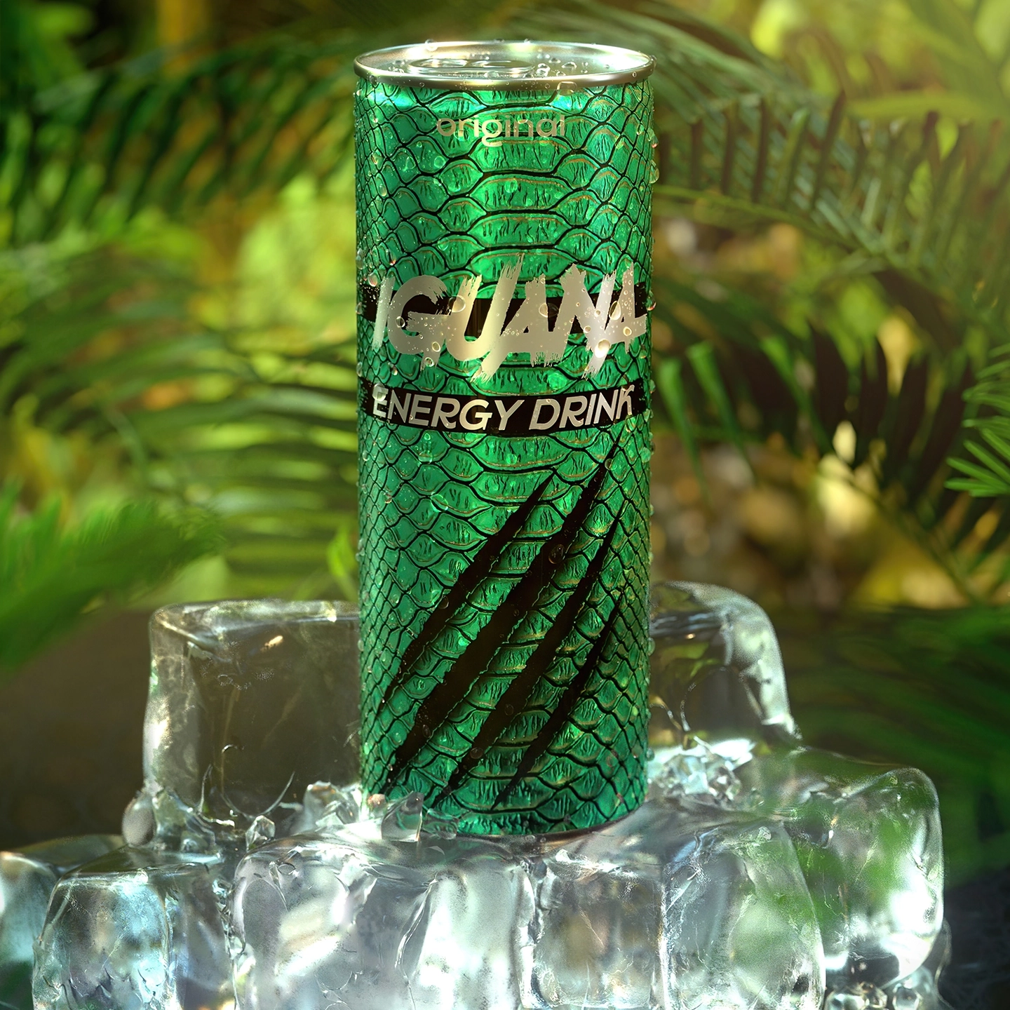
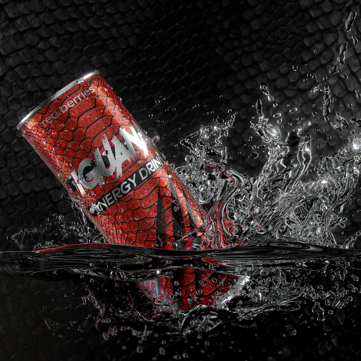
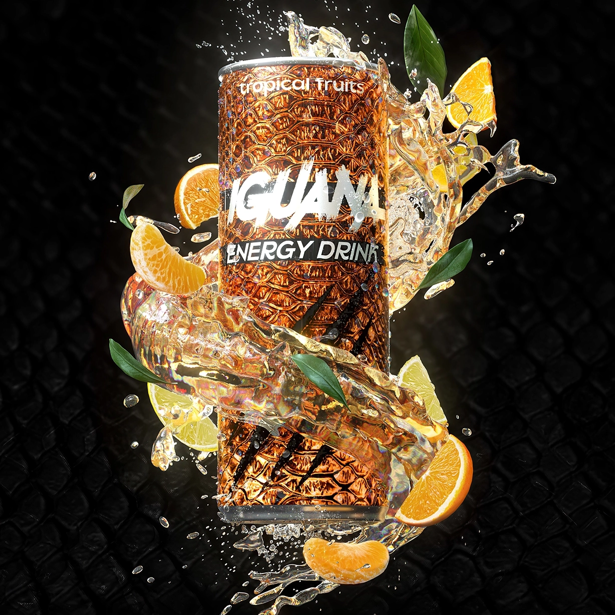
From the start, we knew that the name Iguana provided a natural source of inspiration. One of the earliest ideas was to use the texture of iguana skin as the basis for the design. This concept came to us almost intuitively. To further enhance the packaging’s identity and energy, we added bold “scratches” to the design, evoking strength and vigor.
How long did it take you to design this particular concept?
The entire process took about three weeks. The first week was dedicated to developing the initial concept, while the following two weeks were spent perfecting the details and refining the layout.
One of the biggest challenges was finding the right size and style for the scale pattern. We experimented with various sizes—sometimes they were too large and overwhelmed the design, while other times they were too small to make an impact. After extensive testing, we found the perfect balance.
This project has earned several prestigious awards in packaging design, highlighting its bold and innovative approach. The most notable achievement is the Silver Award in the Packaging Design category at the A’ Design Awards 2022, an international competition that celebrates excellence in design. The work also received glowing reviews from the competition’s jury, who praised its originality, visual impact, and seamless integration of the brand’s identity into the packaging. This recognition cements Iguana’s packaging as a standout example of creativity and functionality in the world of energy drinks.
What Makes It Unique?
In the energy drink category, Iguana stands out as the only product with this kind of implementation. The use of scales and claw-like scratches is both daring and unique, giving the product a bold edge over competitors. The packaging design and brand name are deeply intertwined, reinforcing each other. Every detail was thoughtfully crafted to amplify the feeling of strength and energy that the product represents. This cohesive design successfully ties the brand name to the product’s packaging, making it instantly recognizable and highly appealing to the target audience.
