Challenge
Project Goals:
The client, an IT company based in the USA and serving exclusively the American market, sought to develop a full branding identity from scratch. The objective was to create a cohesive, modern brand image that would resonate with the "Everyman" archetype, reflecting values of approachability, reliability, and inclusivity. The branding needed to differentiate the company from its competitors in the highly competitive tech industry while maintaining a clear, accessible visual language.
Strategy
The branding strategy was built around the Everyman archetype, chosen to align the company’s messaging and identity with a sense of trust, authenticity, and simplicity. The focus was on creating an identity that felt welcoming and relatable to a broad audience, particularly mid-sized businesses looking for reliable IT services.
Key elements of the strategy included:
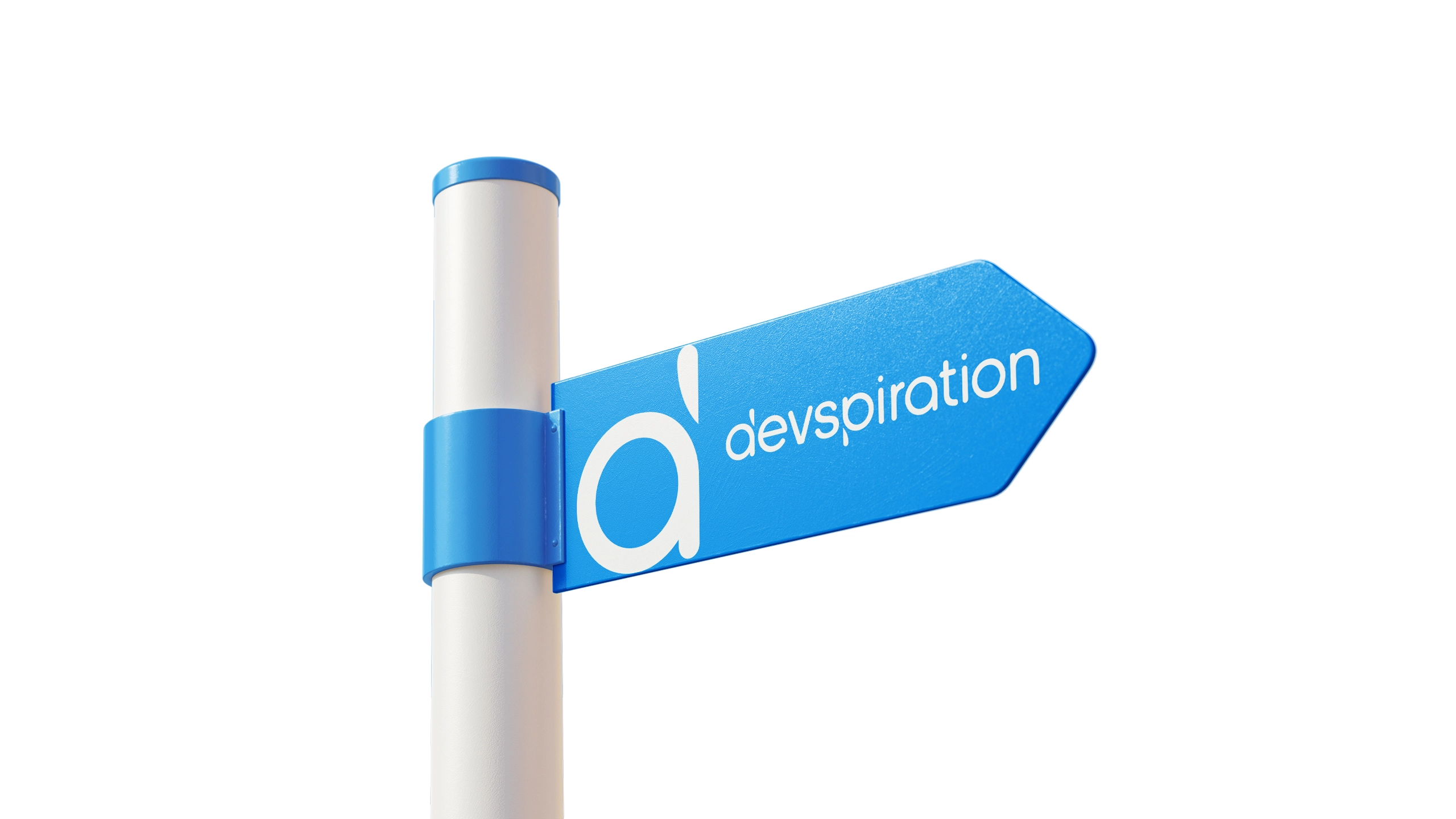
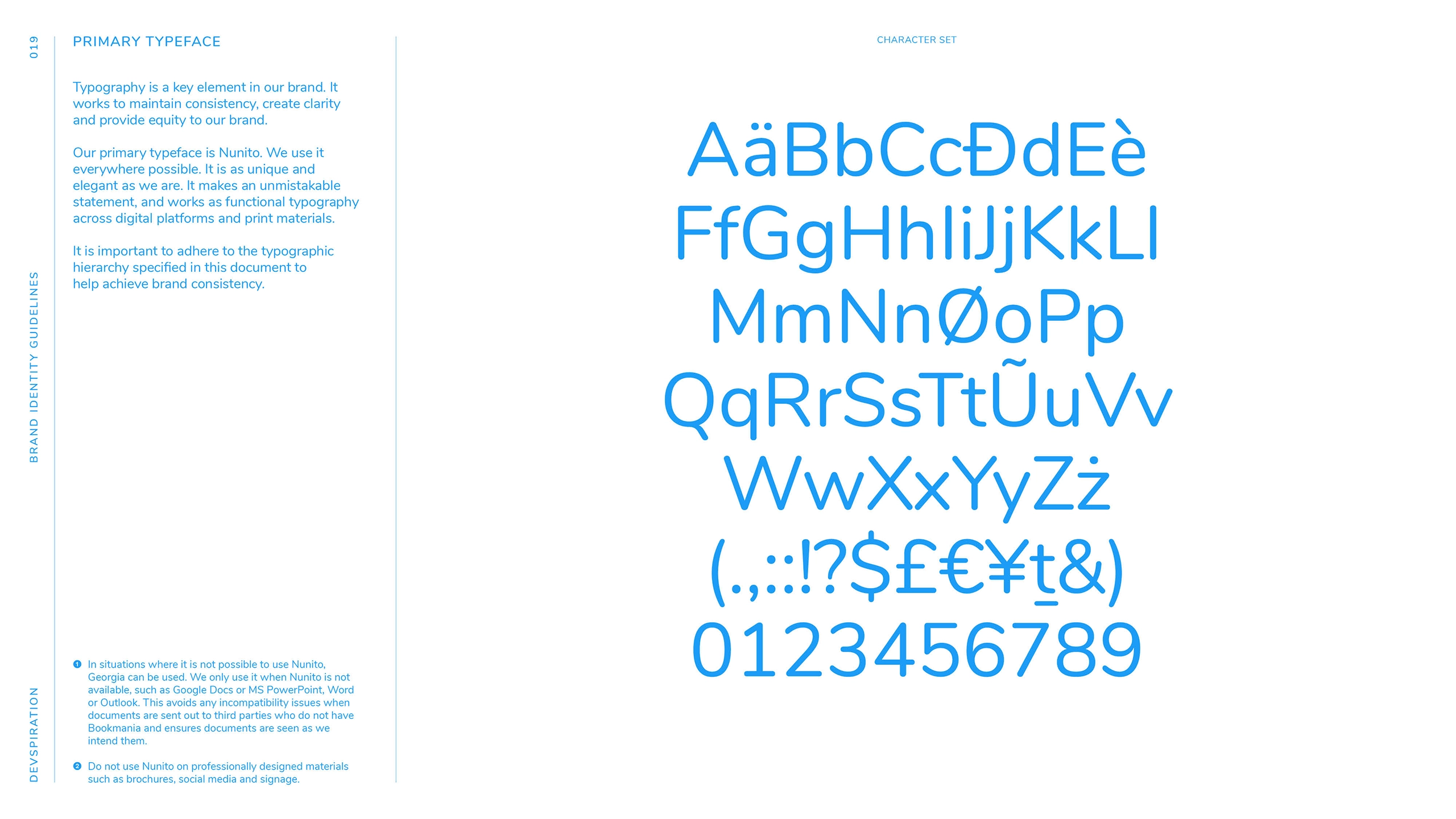
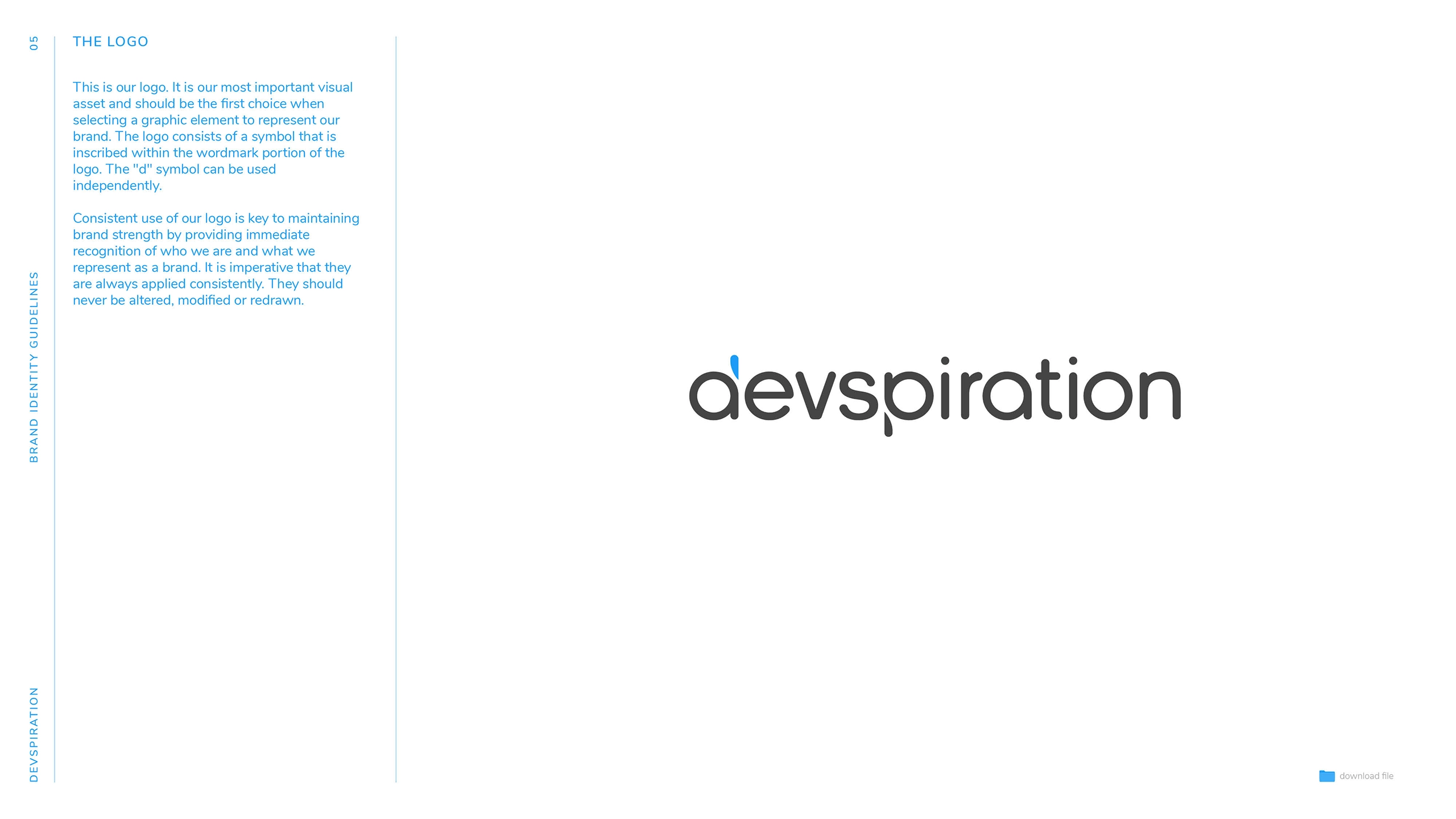
Typography: Exceptional attention was given to typography. Over 300 fonts were tested to find the perfect typeface for the logo, balancing modernity with simplicity.
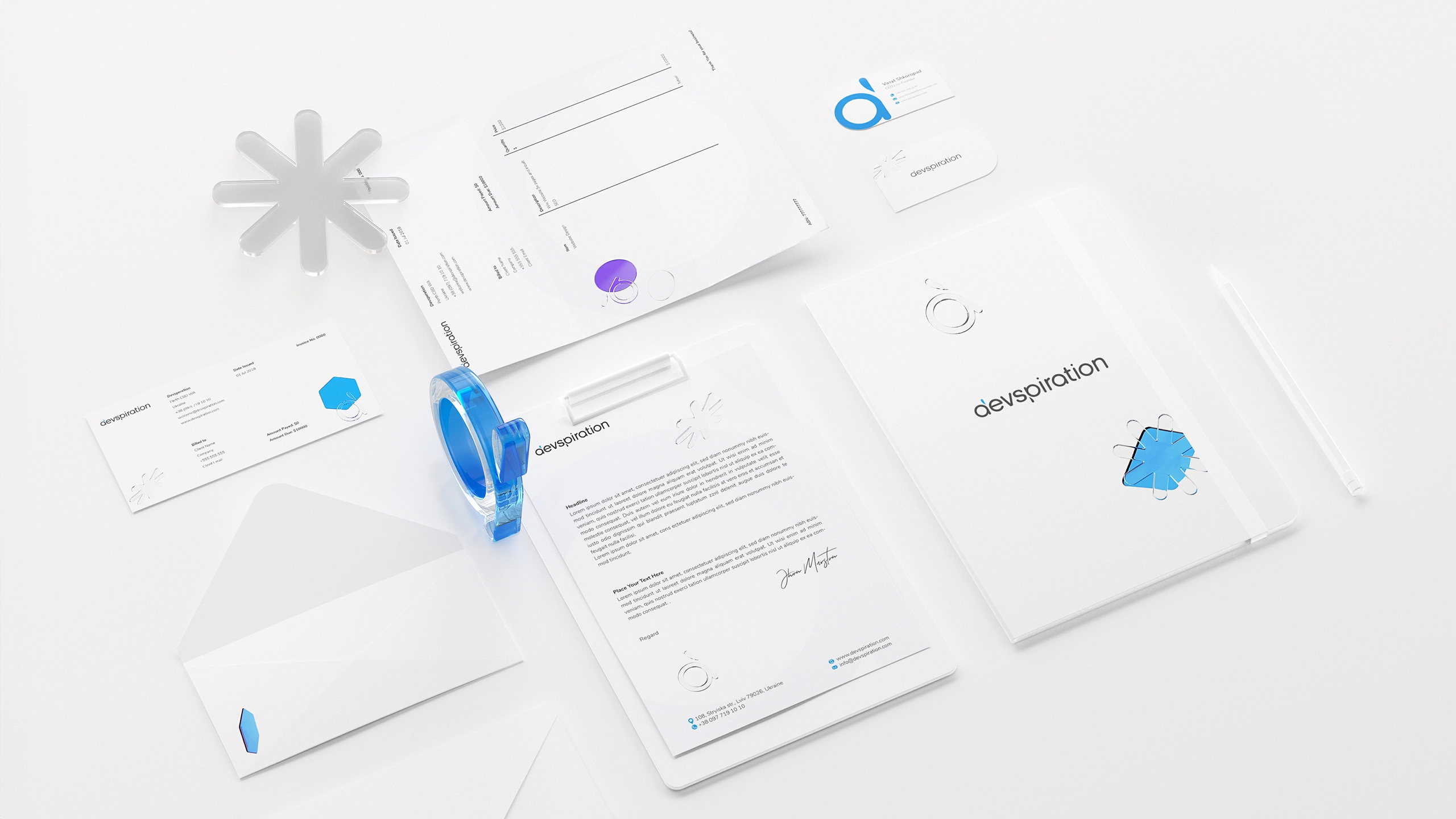
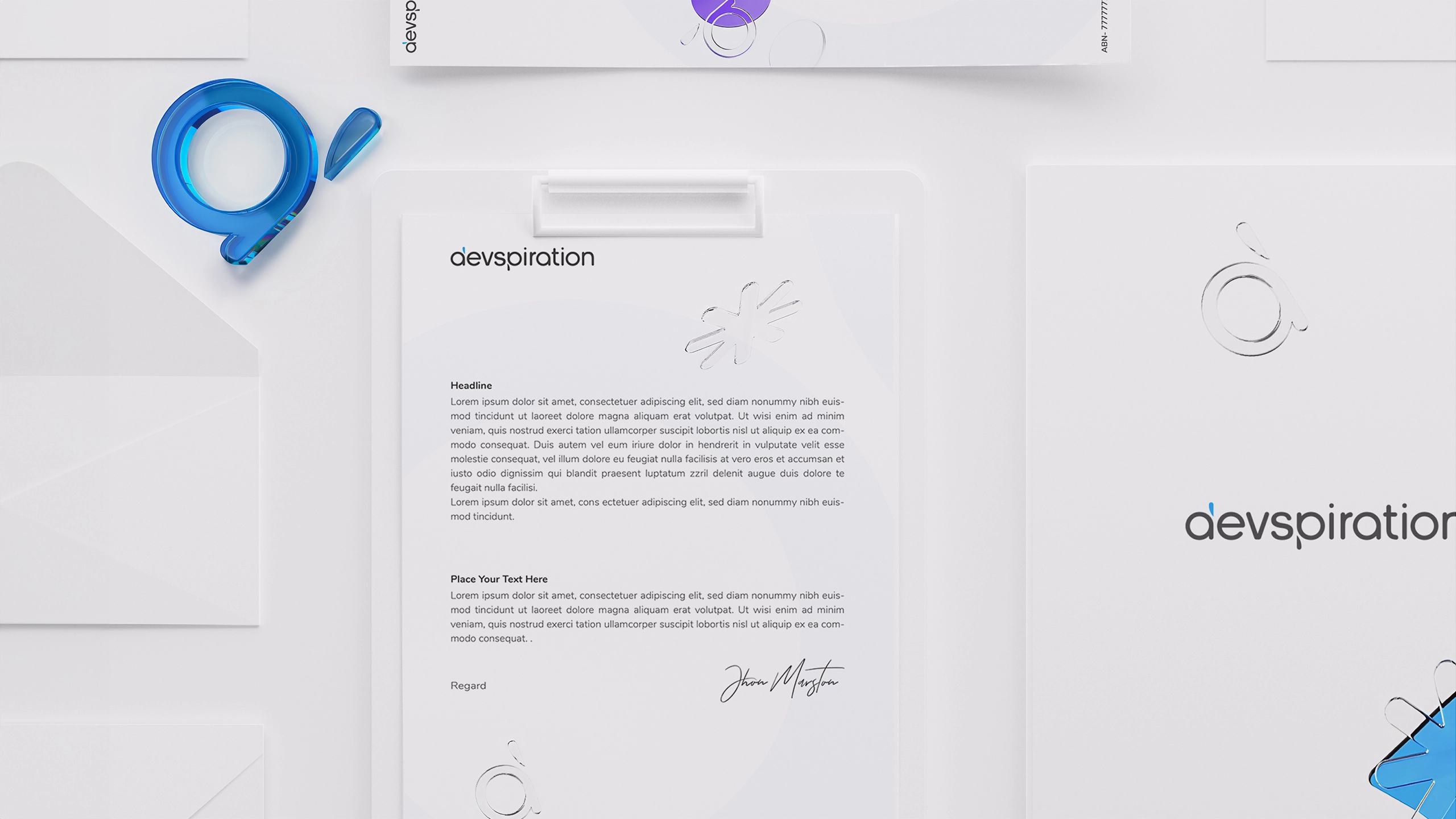
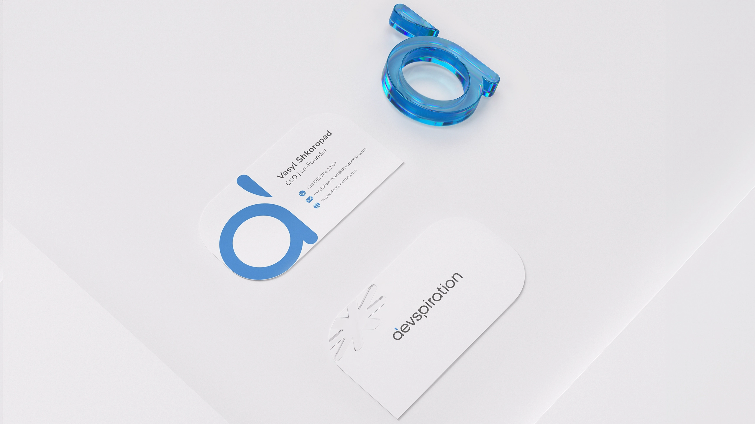
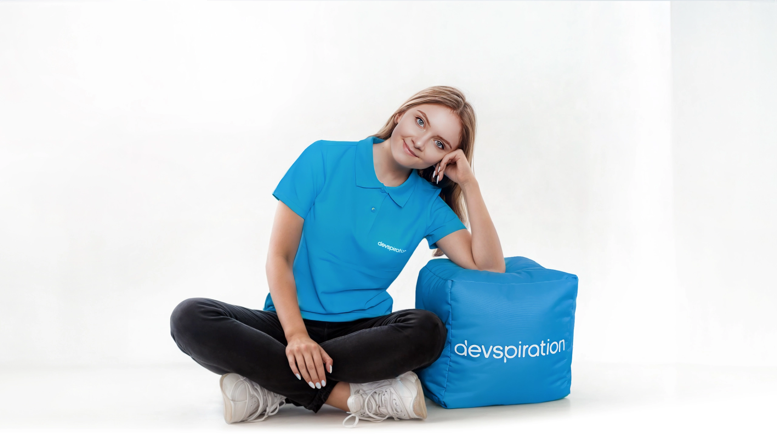
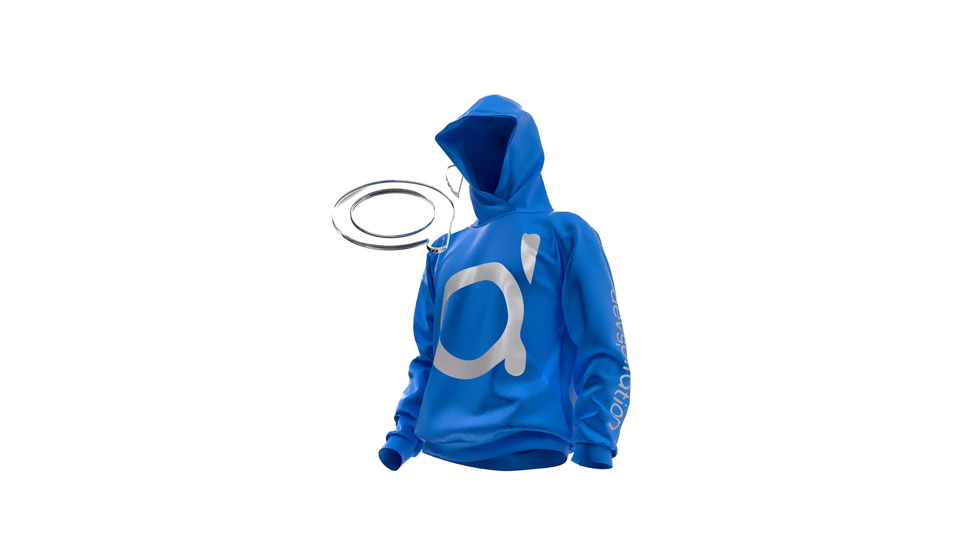
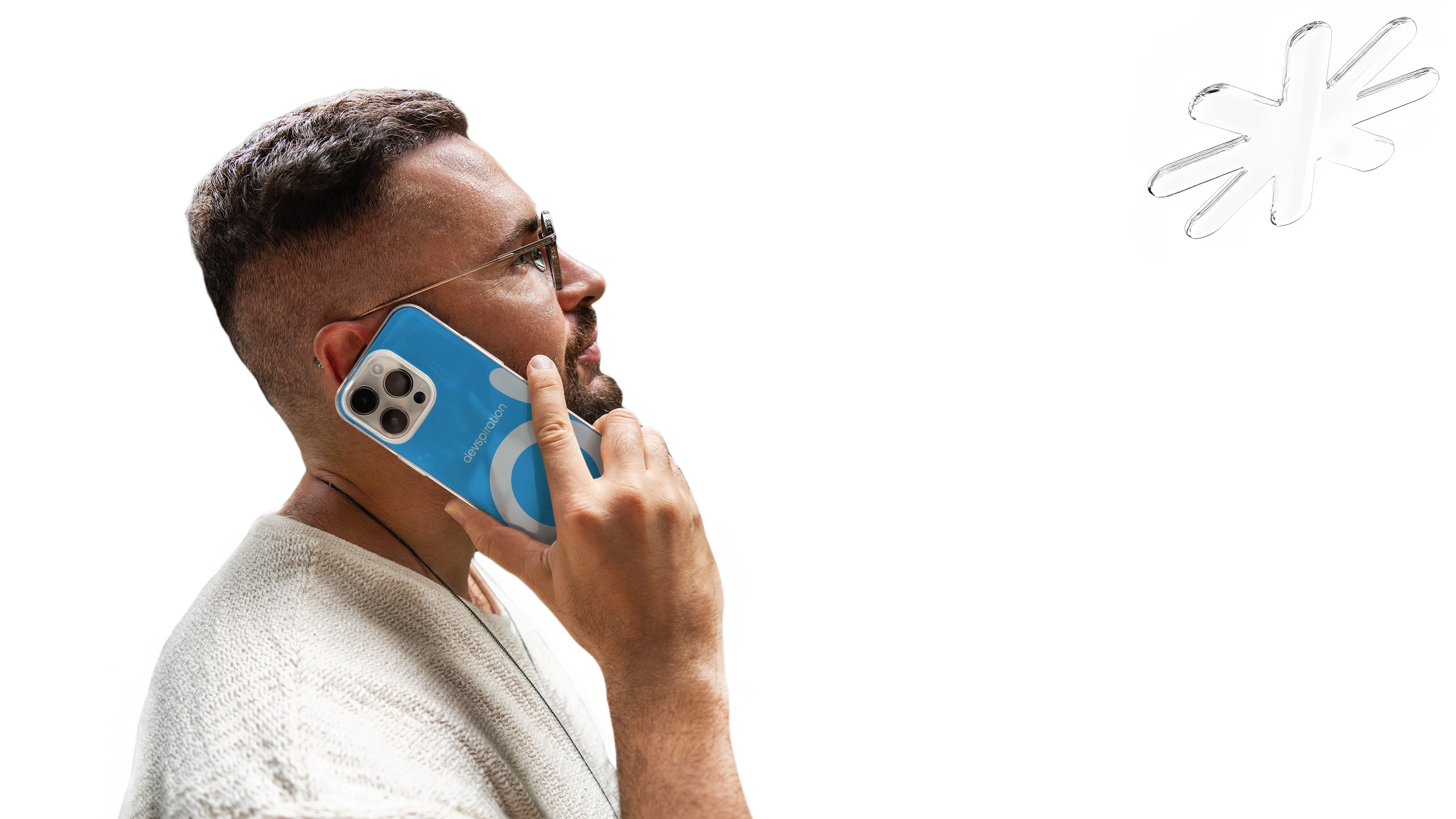
Visual Identity: A clean, light, and intuitive design system was developed, emphasizing a user-friendly, approachable aesthetic. The brand’s visual elements were integrated into a comprehensive style guide to ensure consistency across all touchpoints.
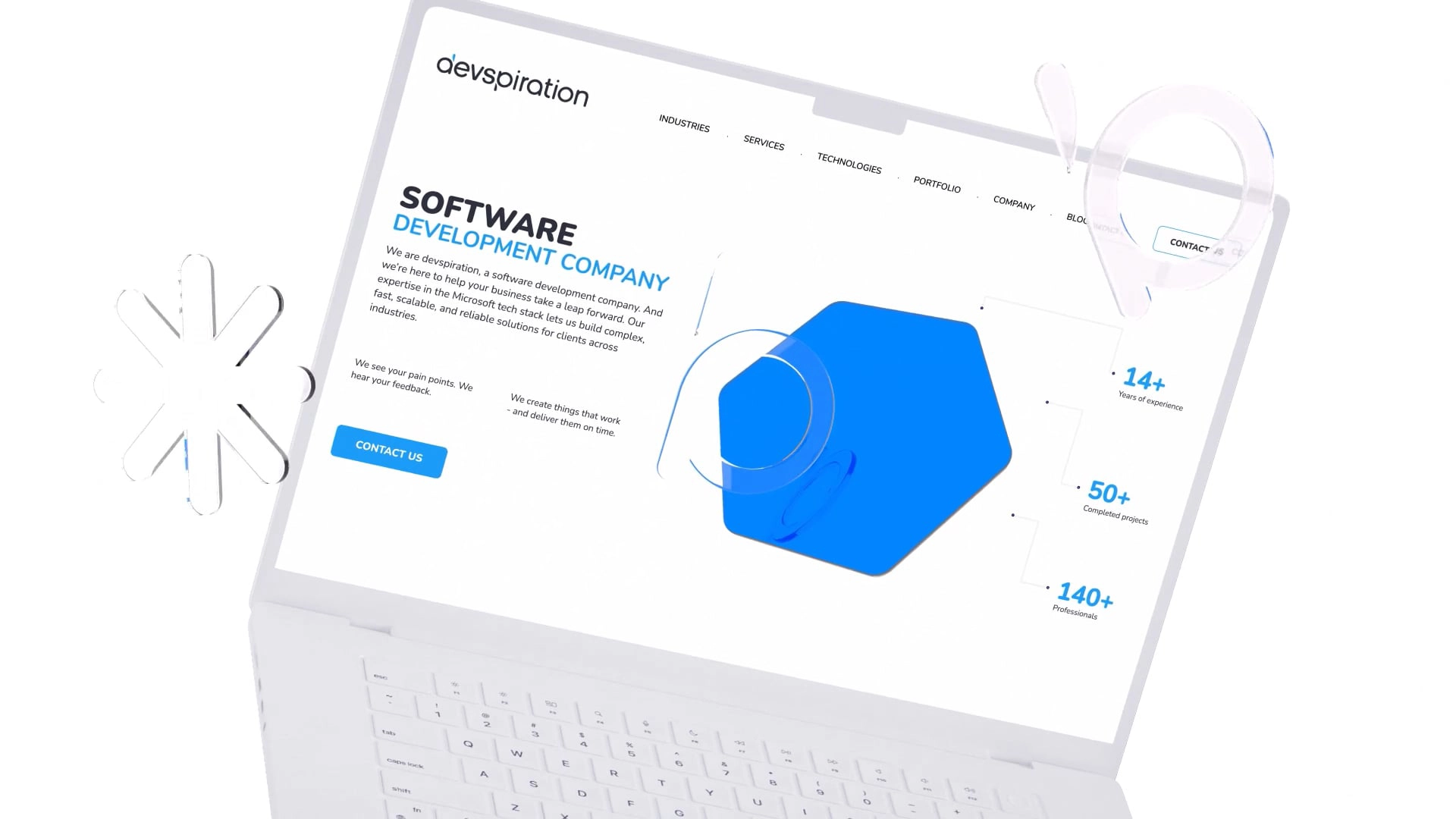
Website Design: A multi-page website was created from scratch, focusing on a light, intuitive design that supported ease of navigation and reflected the brand's overall simplicity and accessibility. The site was built with a responsive layout and a clear hierarchy, ensuring seamless user experiences on both desktop and mobile devices.

The way the site flows and the brand's visual style instantly tell me that this is a company I can trust. It feels professional, but also human.
Solution
The solution included:
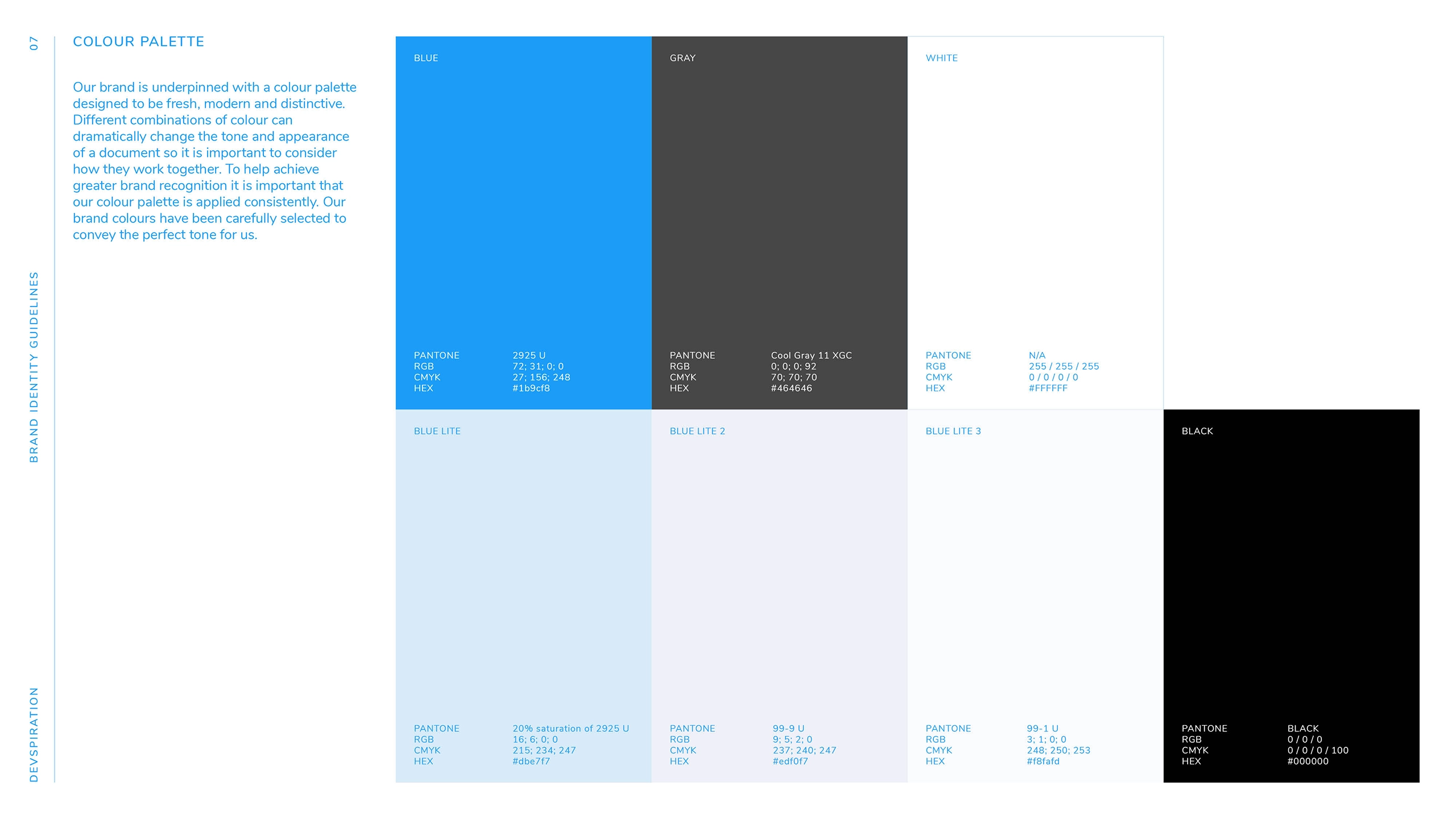
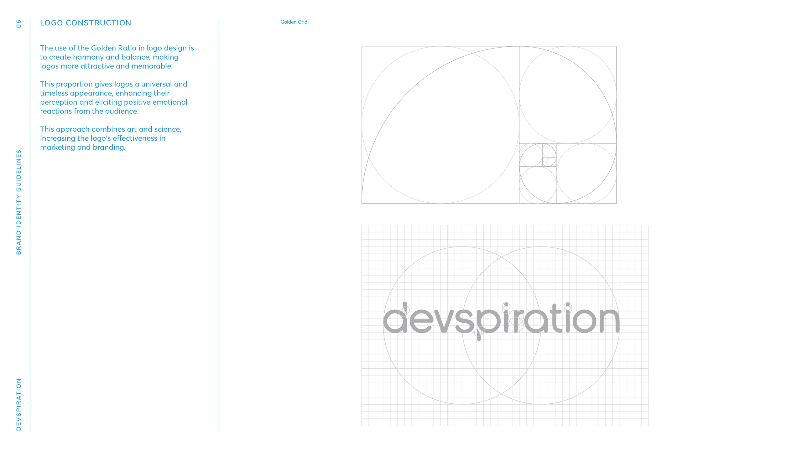
Comprehensive Brand Identity: Created a cohesive brand identity based on the Everyman archetype, including logo design, color palettes, and tone of voice.
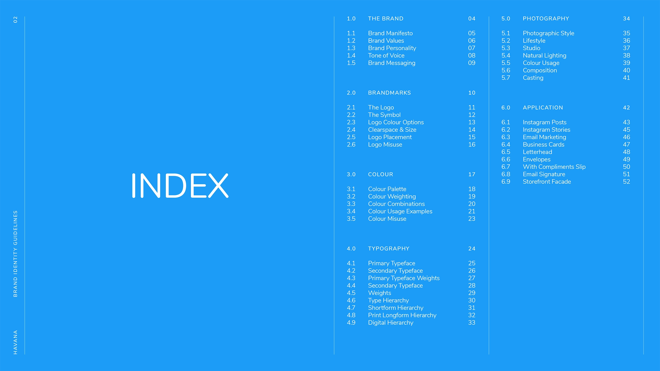
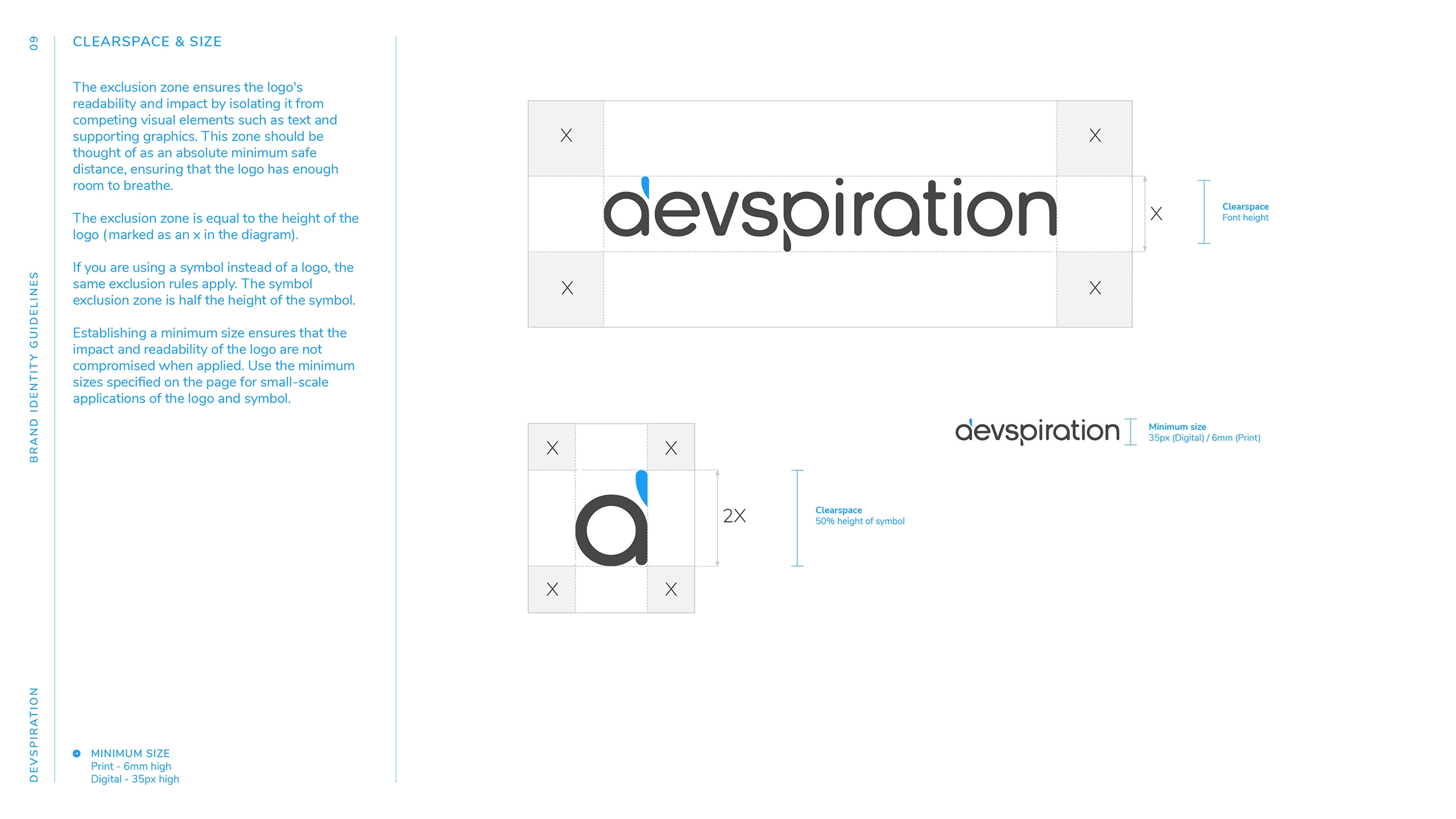
Style Guide: Developed a detailed style guide, outlining typography, color schemes, logo usage, and other brand assets to ensure consistency across all platforms.
Website Development: Designed and launched a multi-page website that reflected the brand’s visual identity—clean, light, and easy to navigate.
Results
Successful brand identity launch: The brand successfully differentiated itself in the competitive IT market by embracing the Everyman archetype, building a relatable and trustworthy image.
Increased customer engagement: The company’s approachable, clear messaging and intuitive website design attracted more mid-sized business clients, leading to increased inquiries and conversions.
Consistency across platforms: The style guide provided the company with a solid foundation for consistent brand messaging and visuals, ensuring a seamless user experience across all touchpoints.
Team
- Dmytro Lynnyk
- Creative Director
- Iryna Lynnyk
- UI/UX Director
- Iryna Ushakova
- Graphic Designer
- Lina Smiychyk
- Project Manager
- Volodymyr Natalenko
- Web Designer
- Vladyslav Skirko
- Sr. Front-End Developer


